

NH3 Clean Energy
I led the rebrand of an ASX-listed clean-energy company, from a dated, generic identity to NH3 Clean Energy Australia: a distinctive, investor-facing brand built around its real direction, ammonia. As principal design consultant on a six-week runway, I co-directed the naming, designed the visual identity, and delivered the executive pitch, under public-market scrutiny. The stock rose 341% post-rebrand.
Role
Principal Design Consultant
Industry
Clean energy (ASX-listed)
Team
Solo designer
Timeline
6 weeks


Problem
A dated brand that told investors nothing
Hexagon Energy Materials (ASX: HXG) was making large, foundational changes to its business, pivoting toward low-emissions ammonia for the Asian energy market. But its brand hadn't moved with it. HXG was a dated, generic identity, close to a misnomer, conveying no clear business, no direction, and nothing distinctive to the investors it now needed to win.
The timing made it high-stakes. The rebrand had to land at a genuine pivot point, signalling the new strategy clearly enough that the capital markets would re-rate the company, not just notice a new logo. And it had to do that as a publicly listed company, where every brand decision is visible to shareholders and carries real, perceivable monetary risk. Little room, a short runway: get the perception shift right, under scrutiny, or dent confidence at exactly the wrong moment.
Process
Blue energy, not another green story
The central bet was distinction. With the positioning team, I helped land on the chemistry as the brand, NH3, ammonia's compound, then designed it as a bold, scientific wordmark, a visual hammer that catches the eye and signals refinement rather than risk. I paired it with a deliberate colour choice, NH3 Blue, to step out of the category entirely. Energy brands are green or old-school orange; going blue said this was neither, a clean, transparent, confident new entrant.
I built a motif system to carry the story across every investor-facing channel: a triple chevron for forward movement and leadership, and three circles echoing the NH3 compound, with room left for product expansion. The product itself, Ammonia Power-Fuel, was named and styled to sit against premium fuels like Shell V-Power, making an unfamiliar energy source instantly legible.
The hardest part was delivery. This was a public company, so every choice carried perceivable risk. I learned the ammonia space in weeks, worked through heavy stakeholder deliberation, and pitched the brand to the executive team myself.
Outcome
Repositioned, and the market followed
The rebrand gave the company a clear, distinctive identity built for the investors it was chasing. HXG became NH3 Clean Energy Australia, repositioned around low-emissions ammonia and aimed squarely at a modern investor audience, with a full visual system, a flagship product brand, and an executive-ready story delivered under public-market scrutiny.
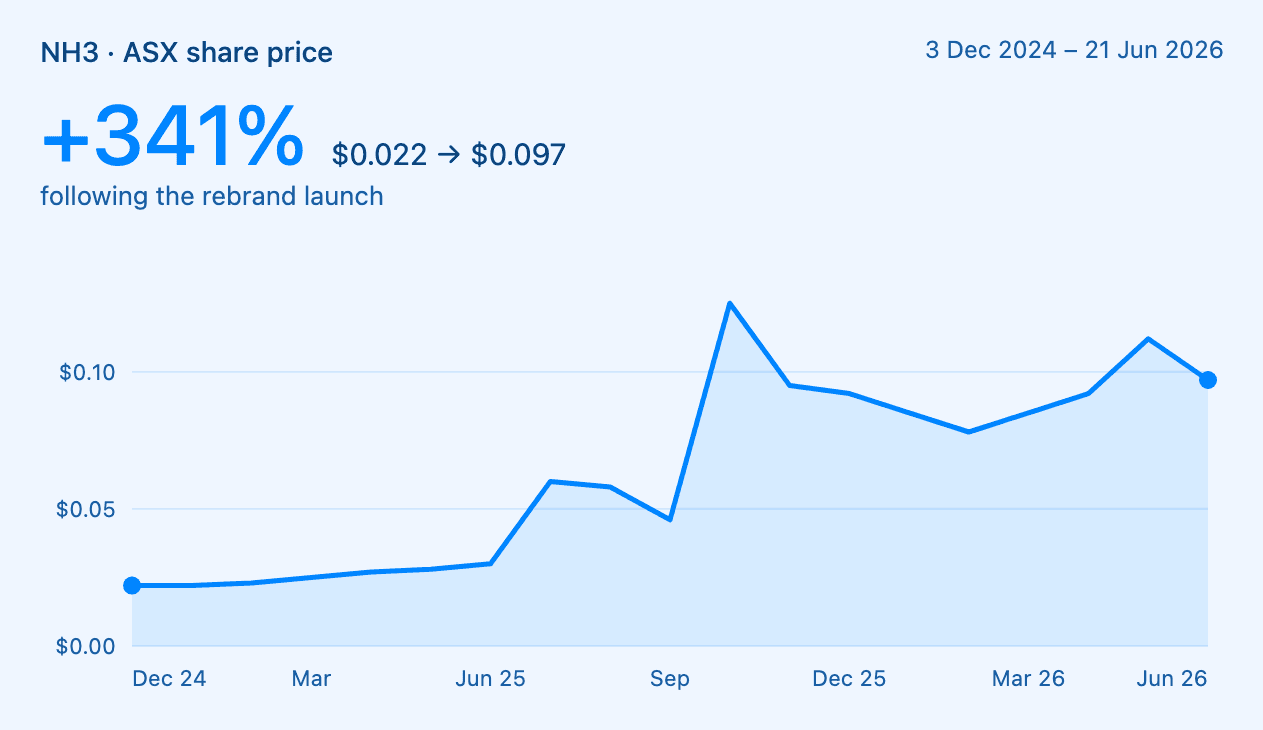
The market responded. Following the rebrand, the stock moved from $0.022 to $0.097, a 341% increase, on a company carrying a $58M-plus market cap. For a small ASX-listed business, repositioning the brand and the story is one of the few levers that can shift how the market sees you, and here it visibly did.
341%
Share-price rise post-rebrand
$0.022 → $0.097
Share price, before to after
$58M+
ASX-listed market cap
Reflection
My first rebrand with a share price attached
Most of my work until then had been startups, VC and private companies, where a brand misstep is recoverable. This was a publicly listed company, where the same decisions carry visible, monetary consequences. That raised the bar on every call. I learned the ammonia and clean-energy space fast, worked through heavy executive deliberation, and still committed to bold moves like "blue, not green".
What I took from it: when the stakes are public, conviction has to be backed by reasoning the room can follow, which is why the pitch mattered as much as the design.